基本介绍
Tip是一个提示信息组件,该组件主要用来展示与用户的鼠标动作无直接相关的提示信息,通过指定位置或者锚定对象来显示。例如数据保存后的数据提示,任务执行结束之后的提示信息等。
基本使用
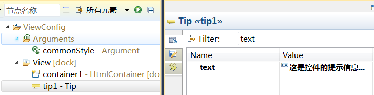
通常情况下我们可以在View视图中添加一个Tip控件,并设置其text属性:
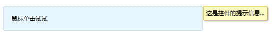
这个时候如果我们希望这个Tip显示在某个页面元素中,就可以通过如下两行代码实现:
tip1.set("anchorTarget", controlxxx);//利用FloatControl控件的anchorTarget特性Tip浮动的目标控件
tip1.set("align", "right");//设定Tip控件显示在anchorTarget指定控件的右侧
tip1.show();//显示Tip控件
如果这个页面元素不是Dorado控件,而是一个DOM元素,则可将上面的代码调整为:
tip1.set("anchorTarget", $jQuery("div1"));//利用FloatControl控件的anchorTarget特性Tip浮动的目标控件
tip1.set("align", "right");//设定Tip控件显示在anchorTarget指定DOM元素的右侧
tip1.show();//显示Tip控件
本例我们在container1的onClick中添加如下代码:
// @Bind #container1.onClick
!function(self, tip1) {
	tip1.set("anchorTarget", self);
	tip1.set("align", "right");
	tip1.show();
}
效果如:
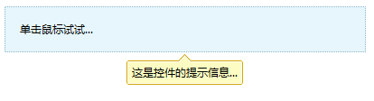
或者代码调整为:
// @Bind #container1.onClick
!function(self, tip1) {
	tip1.set("anchorTarget", self);
	tip1.set("align", "right");
    tip1.set("vAlign", "center");
	tip1.show();
}
效果如:
属性详细说明
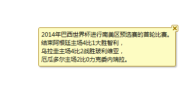
text
Tip控件显示的内容,本文范例已经有说明
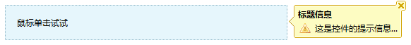
caption
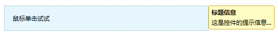
通过caption可以为text内容添加一个标题,如:

caption运行效果:
content
content的功能等同text属性,差别text只能支持简单的文本显示,但是content可以支持更复杂的格式,如HTML,JSON,DOM甚至是Dorado的控件,如:
HTML:
// @Bind #container1.onClick
!function(self, tip1) {
	tip1.set("content", "<div>详情请访问<a href='http://www.bsdn.org'>BSDN</a>!</div>");
	tip1.set("anchorTarget", self);
	tip1.set("align", "right");
	tip1.show();
}
浏览器效果:

JSON:
// @Bind #container1.onClick
!function(self, tip1) {
	tip1.set("content", {
		tagName:"DIV",
		content:[{
			tagName:"Label",
			content:"详情请访问"
		},{
			tagName:"A",
			href:"http://www.bsdn.org",
			content:"BSDN"
		},{
			tagName:"Label",
			content:"!"
		}]
	});
	tip1.set("anchorTarget", self);
	tip1.set("align", "right");
	tip1.show();
}
它在浏览器中的执行效果与上面的HTML的效果是一致的。
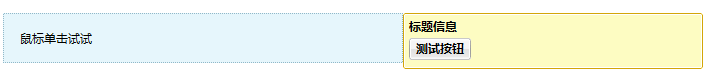
Dorado控件
// @Bind #container1.onClick
!function(self, tip1, floatContainer) {
	tip1.set("content", new dorado.widget.Button({"caption":"测试按钮"}));
	tip1.set("anchorTarget", self);
	tip1.set("align", "right");
	tip1.show();
}
执行效果:
DOM对象
// @Bind #container1.onClick
!function(self, tip1, floatContainer) {
	tip1.set("content", $jQuery("DIVXXX"));
	tip1.set("anchorTarget", self);
	tip1.set("align", "right");
	tip1.show();
}
提供了icon属性
通过icon属性可以自定义图标,效果如下:
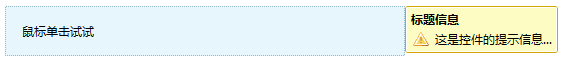
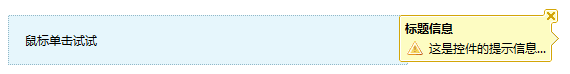
closeable
closeable的默认值为false,如果设置为true,如下图:
界面效果如下(注意右侧有一个可以关闭的小图标):

单击这个图标就可以将系统提示信息隐藏。
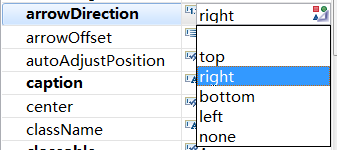
arrowDirection
通过该属性定义提示信息的箭头指示方向,默认值为"none"即不显示,如果改为"left":
如为"right"则:
注意arrowDirection的位置是指箭头相对Tip所处的位置,而不影响Tip在页面上的位置。
arrowDirection的可选值有:
arrowOffset
arrowDirection设置为非none之后系统提示会保护一个箭头,而arrowOffset就是在arrowDirection不变的情况下微调箭头的相对位置,如果arrowDirection为left或right,可以通过arrowOffset上下微调箭头的位置:
| arrowOffset | 效果图 | 说明 |
|---|---|---|
| 0,即默认值 | | 默认箭头居中 |
| -10 | 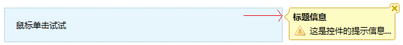 | 负数表示箭头向上微调 |
| 10 | 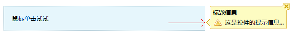 | 正数表示箭头向下微调 |
同样如果arrowDirection的值为top或bottom,则可以通过arrowOffset左右微调箭头的位置:
| arrowOffset | 效果图 | |
|---|---|---|
| 0,即默认值 | 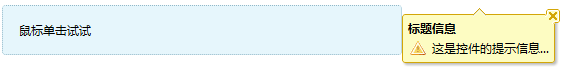 | 默认箭头居中 |
| -30 |  | 负数表示箭头向左微调 |
| 30 | 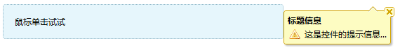 | 负数表示箭头向右微调 |
arrowAlign
arrowAlign的功能与arrowOffset类似,它提供了几个默认值,如果arrowDirection为left或right,则如果你设置arrowAlign为top,center或bottom它会自动根据当前Tip的大小自动计算arrowOffset的值,并自动定位。
showDuration
提示信息自动隐藏时间,单位为秒,默认为空,则不会自动隐藏。如果设置为2秒,则tip显示2秒钟后自动隐藏,效果如下:

Attachments:
 Tip.PNG (image/png)
TipText.PNG (image/png)
TipTextPreview.PNG (image/png)
TipCaption.PNG (image/png)
TipCaptionPreview.png (image/png)
TipContentHtml.PNG (image/png)
TIpContentControl.PNG (image/png)
TipIcon.png (image/png)
TipCloseable.PNG (image/png)
TipCloseablePreview.png (image/png)
TipArrowDirectionLeft.png (image/png)
TipArrowDirectionRight.png (image/png)
TipArrowDirectionList.png (image/png)
arrowOffsetLeft.png (image/png)
arrowOffsetLeft2.png (image/png)
arrowOffsetTopDefault.png (image/png)
arrowOffsetTopLeft.png (image/png)
arrowOffsetTopRight.png (image/png)
showDuration.gif (image/gif)
TipBottomPreview.png (image/png)
Tip.PNG (image/png)
TipText.PNG (image/png)
TipTextPreview.PNG (image/png)
TipCaption.PNG (image/png)
TipCaptionPreview.png (image/png)
TipContentHtml.PNG (image/png)
TIpContentControl.PNG (image/png)
TipIcon.png (image/png)
TipCloseable.PNG (image/png)
TipCloseablePreview.png (image/png)
TipArrowDirectionLeft.png (image/png)
TipArrowDirectionRight.png (image/png)
TipArrowDirectionList.png (image/png)
arrowOffsetLeft.png (image/png)
arrowOffsetLeft2.png (image/png)
arrowOffsetTopDefault.png (image/png)
arrowOffsetTopLeft.png (image/png)
arrowOffsetTopRight.png (image/png)
showDuration.gif (image/gif)
TipBottomPreview.png (image/png)