AutoForm在dorado中的作用类似html中的form表单,用来显示和编辑数据。一般情况下,AutoForm可以帮助我们快速地设计其中元素控件的布局。特别地,由服务器端Java编程动态生成AutoForm。
准备工作
在sample项目的src下新建ViewModel,命名autoform。在新建的ViewModel中新建AutoSqlDataset,命名datasetEmployee。之后再新建AutoForm绑定datasetEmployee,然后,设置datasetEmployee中每个Field的label属性值。(具体创建步骤请参考<列表下拉框ListDropDown>章节)。
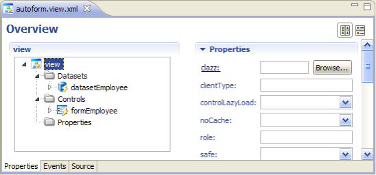
图11-01
设置完成之后新建JSP页面autoform.jsp,通过【Browse】查看效果。
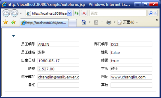
图11-02
默认情况下,大多数的AutoForm中的控件都会以文本框的方式展现。如果对应绑定的Dataset中Field对象的dataType属性值为boolean时,会以checkbox的方式显示。
调整表单布局
- 排列位置设置
在AutoForm控件中,默认的所有控件是按照两列的布局方式排列。
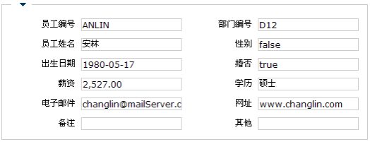
图11-03
在autoform的ViewModel中,设置formEmployee中控件三列显示。步骤:【formEmployee】—>【<FormGroup>】—>【column Count属性值为3】。
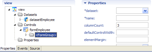
图11-04
保存之后刷新页面,查看修改之后的效果。
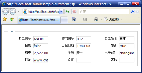
图11-05
- 分组设置
AutoForm还提供了分组展现方式,可以新建多个<FormGroup>对其中的控件进行归类。
修改其中的<FormGroup>的name属性值为group1。步骤:【formEmployee】—>【<FormGroup>】—>【name】。

图11-06
新建Group分组。步骤:【formEmployee】—>【Insert】—>【Group】。

图11-07
新建的分组自动命名为group2,设置group1和group2的title属性值分别为"基本信息"和"备注信息"。
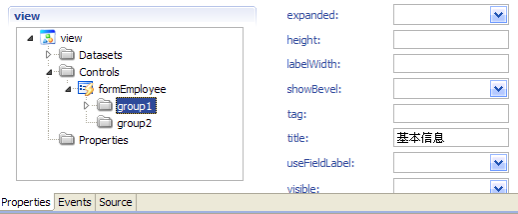
图11-08
把group1中的DEGREE、EMAIL、WEB、CMNT、IMAGE等通过鼠标左键拖入group2中。

图11-09
保存全部修改,刷新页面查看。
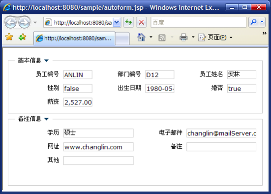
图11-10
从页面中可以看出,在"基本信息"中,由于设置了columnCount属性,控件排列为3列。"备注信息"中的控件仍然按照默认方式排列为2列。并且默认情况下,"基本信息"是展开状态,"备注信息"是关闭状态。
在不同的组中,控件的排列分布可以不同。这可以通过每个<FormGroup>的columenCount属性设置。除此之外,我们还可以通过colspan和rowspan属性设置单个控件的跨行或跨列排列。跨列设置步骤:【formEmployee】—>【group1】—>【EMPLOYEE_ID】—>【colspan】。
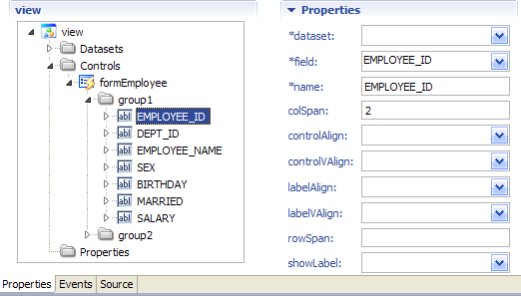
图11-11
跨行设置步骤:【formEmployee】—>【group2】—>【WEB】—>【rowspan属性】。

图11-12
保存设置,刷新页面查看效果。
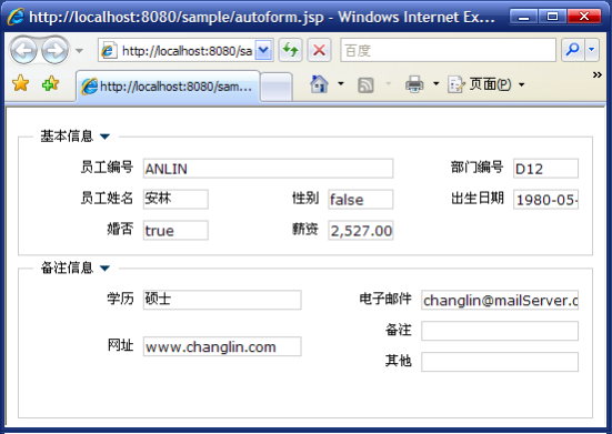
图11-13
设置表单渲染
使用RadioGroup渲染
默认情况下,页面中的"性别"是以值的方式通过文本框展现,界面不够友好。通常我们可以为其绑定下拉框来实现辅助录入,绑定下拉框的Field也可以渲染成RadioGroup的形式。
新建ListDropDown列表下拉框,命名dropdownSex。然后新建dropdownSex的下拉项分别设置。(具体新建请参考<列表下拉框ListDropDown>章节)。
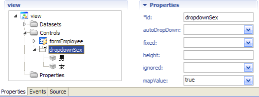
图11-14
设置datasetEmployee中SEX的dropdown属性值为dropdownSex,设置下拉框的绑定。然后删除formEmployee中的SEX控件,并新建RadioGroup控件替换。步骤:【formEmployee】—>【group1】—>【删除SEX控件】—>【右键group1】—>【Insert】—>【RadioGroup Element】。

图11-15
设置新建元素的属性。

图11-16
保存修改,刷新页面查看效果。

图11-17
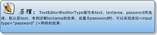
使用TextArea渲染
通常在表单中,文本框中文字较多的情况下,单行文本框无法满足数据的展现。标准HTML中有TextArea可以以文本域的方式查看多行文字,在dorado的AutoForm中,同样可以实现类似效果。
设置步骤:【formEmployee】—>【group2】—>【IMAGE】—>【colspan属性值为2】。
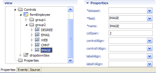
图11-18
然后设置【IMAGE】—>【TextEditor】—>【editorType值为textarea】。
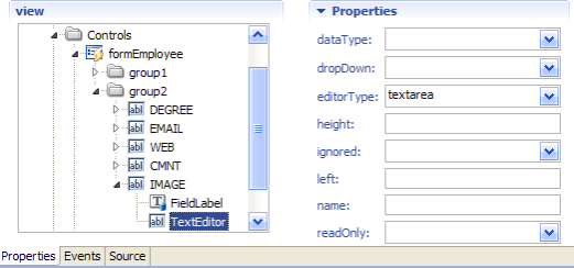
图11-19
保存全部修改,刷新页面查看效果。
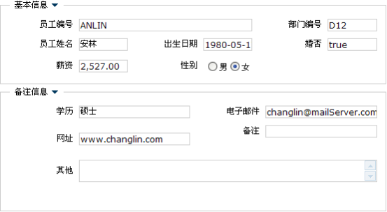
图11-20
使用subwindow渲染
AutoForm表单中的分组风格有两种,默认风格是GroupBox,我们可以修改成SubWindow风格显示。
设置步骤:【formEmployee】—>【groupType属性值为subwindow】。

图11-21
保存之后,刷新页面查看效果。
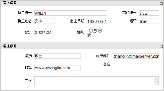
图11-22
开发步骤
AutoForm属于组合控件,其中的单个元素控件可设置其排列布局,也可以根据不同需求改变展现样式。
|
|
 开发步骤
开发步骤
小测验
1.在AutoForm中,下面说法错误的是()【多选】
A)AutoForm中的控件元素只能通过由AutoForm绑定Dataset自动生成。
B)其中的FormGroup不可以绑定Dataset数据对象。
C)一般情况下,AutoForm中的元素被自动创建出来时,其控件类型取决于绑定的Dataset的Field数据类型。
D)AutoForm中可以引入其他的控件,例如Button。
2. 有关AutoForm的内部控件布局,下面说法正确的是()【多选】
A)默认情况下,AutoForm内部的控件布局为两列摆放。
B)可以分别设置FormGroup的摆放列数,使得不同组不同风格。
C)可以单独设置其中控件所占的行数和列数
D)可以设置其中控件的方位靠左或靠右显示,但不能靠上或靠下显示。
小结
本章主要讲解dorado中常用的AutoForm自由表单控件。AutoForm控件是由多个基本元素控件分组的方式构成,其中的组<FormGroup>可以新建多个,其内部的元素控件可以拖拽放置,并设置它们的摆放布局。另外,AutoForm还支持group和subwindow两种不同的分组展现风格。
Attachments:
 worddavec073ac0e39955c0e057c0174a82883c.png (image/png)
worddavd4784a6b09dcf1a0c878d0e427c24d5f.png (image/png)
worddav7dcf3f053c550e3151723502cb536459.png (image/png)
worddavf3a0c1cc6d350658ca2b7657d7fad6ca.png (image/png)
worddav0b059b2d7c4d0a0fbf98b294f27683fe.png (image/png)
worddav924bfeb018ca6eb71f65187d6b3bea31.png (image/png)
worddavb795cbd5fd3bc09973f9ff4baa811d09.png (image/png)
worddav7ba1bf325d956d00400ada596dfc7ba3.png (image/png)
worddavab137155ac35a42d9ea0707d8ecb3290.png (image/png)
worddave9467d34c42875929b9520063e13ac1c.png (image/png)
worddav874466f4b67aba78901214b5747f4461.png (image/png)
worddav9a8f3948d51c768f00bed56a8103617a.png (image/png)
worddavdfce437a2b45cafb09847c77fe302f87.png (image/png)
worddavabec76aa6e7cabaeb1627e257c810170.png (image/png)
worddav6d1f1a4377f44a60b3cf0fecf27c863b.png (image/png)
worddave2acf6e7599dab03f162229a92fddbc5.png (image/png)
worddavca4b4bf8047dc52f762bec9813706c15.png (image/png)
worddavb966e17cb2a7cdd9b09c8920a1ab3b79.png (image/png)
worddav042ef06acabbd415ea1613a7c53e32fa.png (image/png)
worddavbde2309e5c0b826d866a0c4a10deaca3.png (image/png)
worddavee8056b59175933cca01e701277c5076.png (image/png)
worddav5fb2f540e72e8cb41319d76bddb99923.png (image/png)
worddav0173ccc5a9444cd97501eddcecb27f90.png (image/png)
worddava3459b8b2b03d861686269a798cad701.png (image/png)
worddavd082798e4a877c3572d13dac8583825b.png (image/png)
worddavec073ac0e39955c0e057c0174a82883c.png (image/png)
worddavd4784a6b09dcf1a0c878d0e427c24d5f.png (image/png)
worddav7dcf3f053c550e3151723502cb536459.png (image/png)
worddavf3a0c1cc6d350658ca2b7657d7fad6ca.png (image/png)
worddav0b059b2d7c4d0a0fbf98b294f27683fe.png (image/png)
worddav924bfeb018ca6eb71f65187d6b3bea31.png (image/png)
worddavb795cbd5fd3bc09973f9ff4baa811d09.png (image/png)
worddav7ba1bf325d956d00400ada596dfc7ba3.png (image/png)
worddavab137155ac35a42d9ea0707d8ecb3290.png (image/png)
worddave9467d34c42875929b9520063e13ac1c.png (image/png)
worddav874466f4b67aba78901214b5747f4461.png (image/png)
worddav9a8f3948d51c768f00bed56a8103617a.png (image/png)
worddavdfce437a2b45cafb09847c77fe302f87.png (image/png)
worddavabec76aa6e7cabaeb1627e257c810170.png (image/png)
worddav6d1f1a4377f44a60b3cf0fecf27c863b.png (image/png)
worddave2acf6e7599dab03f162229a92fddbc5.png (image/png)
worddavca4b4bf8047dc52f762bec9813706c15.png (image/png)
worddavb966e17cb2a7cdd9b09c8920a1ab3b79.png (image/png)
worddav042ef06acabbd415ea1613a7c53e32fa.png (image/png)
worddavbde2309e5c0b826d866a0c4a10deaca3.png (image/png)
worddavee8056b59175933cca01e701277c5076.png (image/png)
worddav5fb2f540e72e8cb41319d76bddb99923.png (image/png)
worddav0173ccc5a9444cd97501eddcecb27f90.png (image/png)
worddava3459b8b2b03d861686269a798cad701.png (image/png)
worddavd082798e4a877c3572d13dac8583825b.png (image/png)